A New Tea Brand

Pure Leaf - Unilever Food Solution
Working with Unilever Food Solution (UFS) as a UX creative and visual designer. Tasked with creating information architecture and visual design of their AU/NZ website on an end to end project. Along side this, was the need to create design system and rules around microsites for different campaigns and promotion material channels.

Pure Leaf is a new premium tea brand for UFS and this brand has been launched in Europe and North America with stand-alone websites. From the visual perspective, brand assets have been developed by the global team and are available for use, we need to adapt assets for local purpose.
What's the problem?
Where is the engagement? Some quick guerrilla testing provided useful insights including: some users said they can’t tell the difference and uniqueness between Pure Leaf and other tea brands such as T2 and Twinings; some thought the website looked dated; and many couldn’t find the content they were looking for. User didn’t know how to engage or how to find relevant information.
Site Messaging: The feed back from global research team shows that users feel the websites of other countries are very ‘eCom like’. In the AU/NZ zite, we are looking for a clear balance of brand and Sales messaging.
Let's get agile
Working closely with the UFS’s marketing and sales team. After few workshops, we srart to building a better understanding of strategy, growth and marketing then we start creating solutions that not only delight their target users but help push the Pure Leaf brand in the right direction.


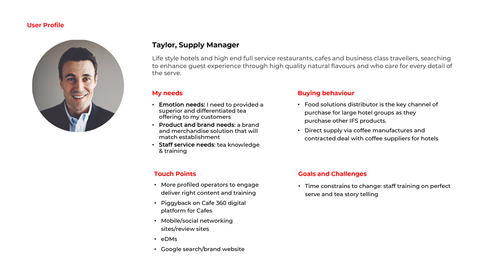
User profile
Using the information collected from workshops, I created user profiles to help me communicate the user’s needs and behaviours to the team.
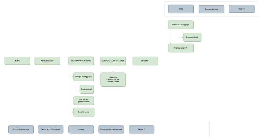
Information architecture
Design
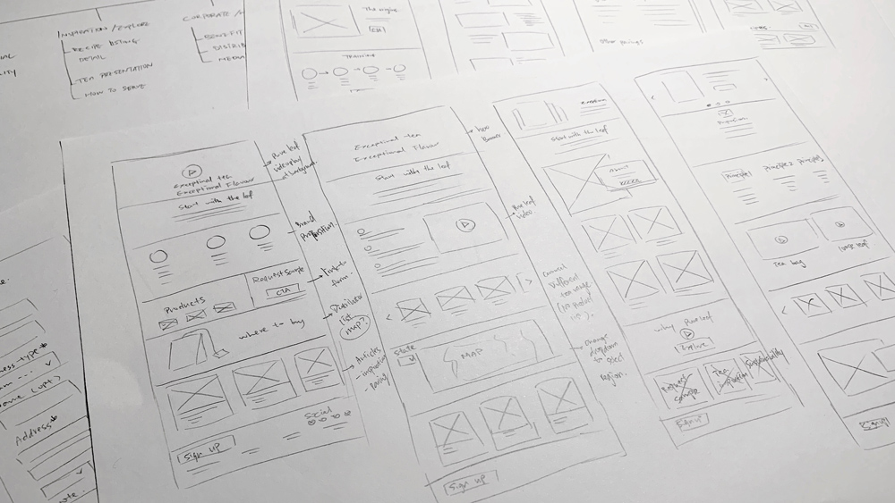
We sketched ideas, experiences user journeys and outcomes all with brand story in mind.
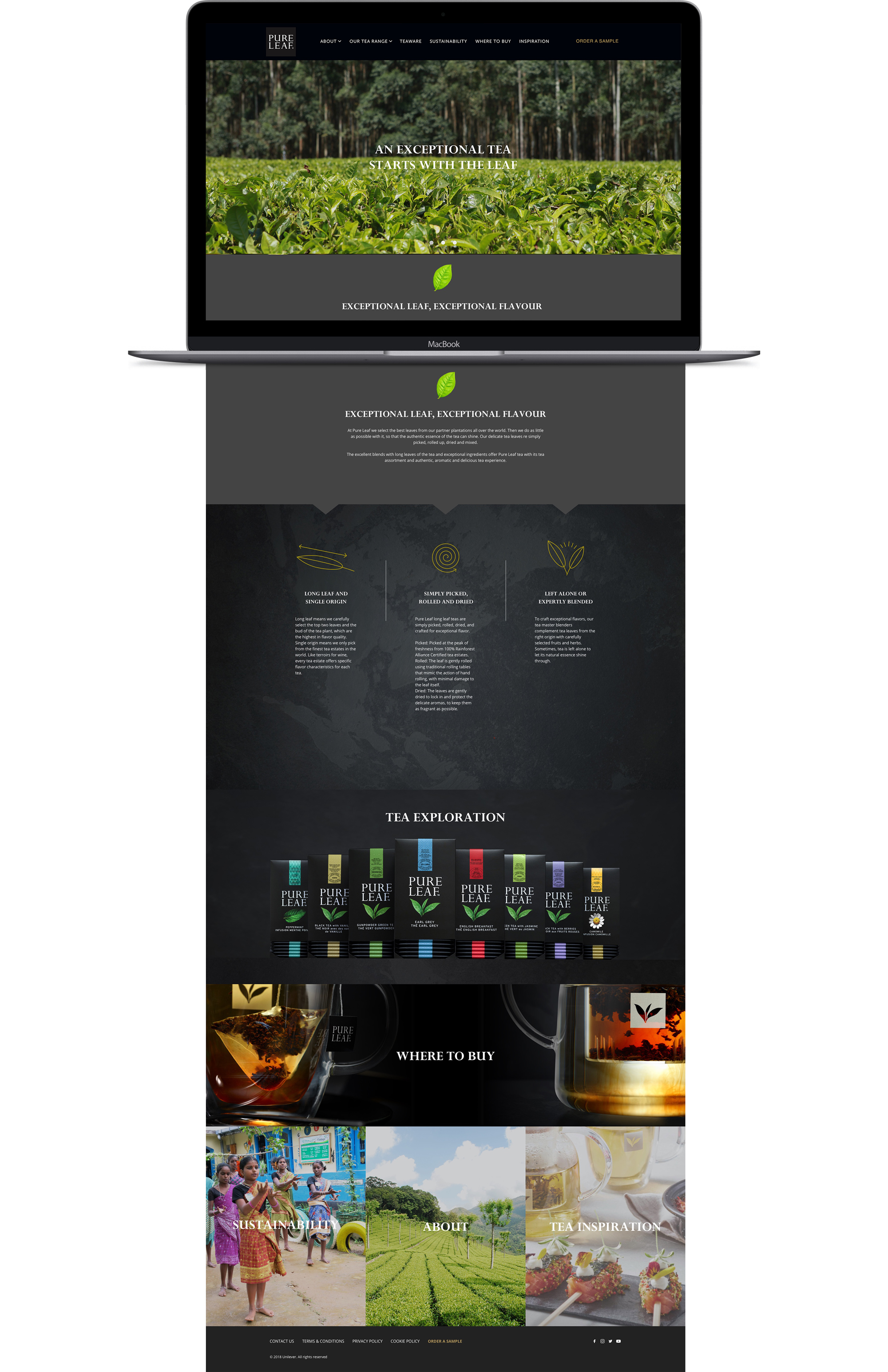
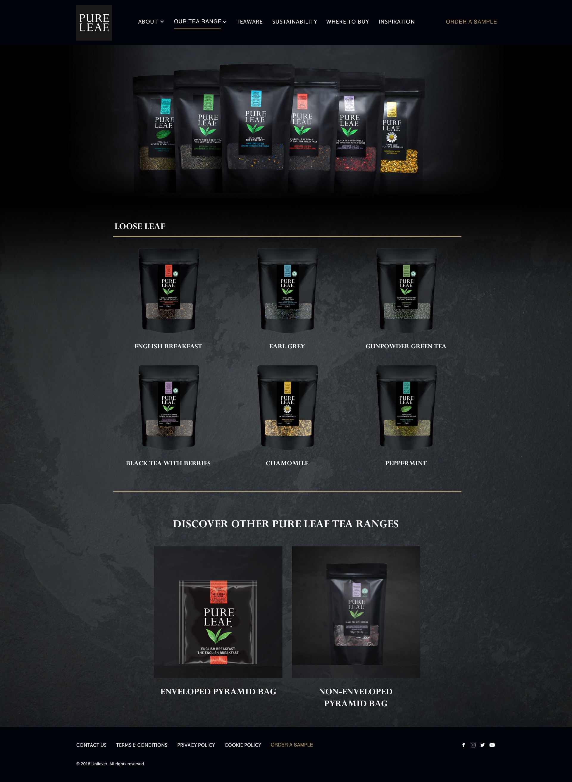
As this tea range is only targeting to Premium/trendy cafes and 4-5 Star hotels for 2019, It’s important to tell the brand story to their potential customer to give them a reason to sign on. We developed the idea of a site built around a sales funnel.
Each page was oriented around a goal. We needed to emphasise the visual hierarchy, to providing users with the core information as well as drawing user’s attention to a product.
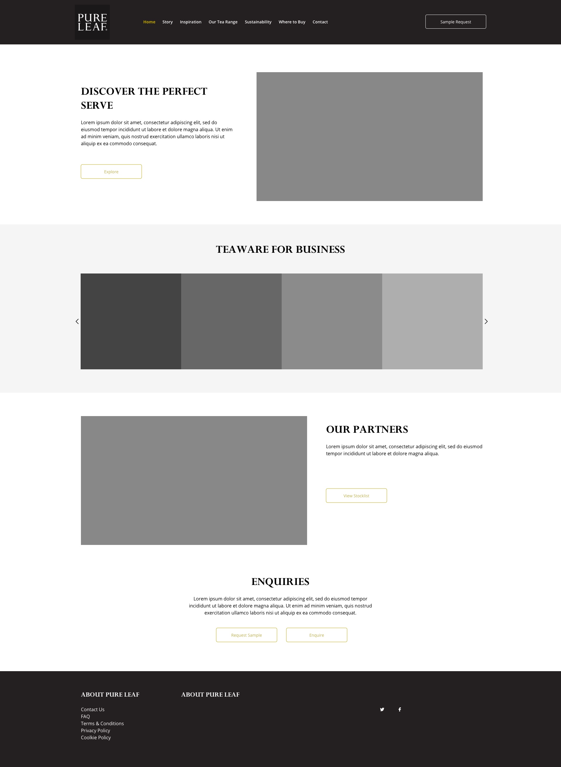


Once client approved the wireframes, it was time to start on the visual design. At this stage, we can finally see things come together. We started with a dark look to create an elegant and premium appeal to represent the brand. In the testing we found that the site have a tendency to feel ‘heavy’. We increased the white space to frame each piece of content in order to provides more breathing room. The point here is that white (black) space and images gradually guide the user down to the end of the page which effectively improved readability.


What's next
Targeting to consumer market. To add e-commerce functionality on the website. Also further research is required to understand user’s needs in order to provide them more personalised experience.