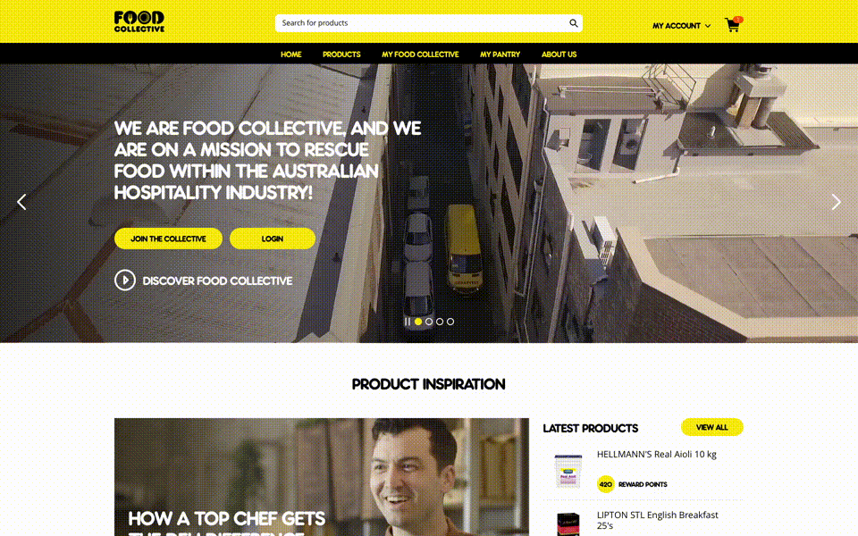
We teamed up with Unilever Food Solution to introduce a new e-commerce website Food Collective AU with a loyalty component. As the group prepared for an e-commerce platform and future growth, they needed a solid design foundation and shared way of working to create better customer experiences more efficiently.

Food Collective - Design System
The Challenge
Offshore design and development teams were working in isolation, each with their own tools, design elements, and documentation styles and duplicating the same work. It needed a solid design foundation and shared way of working to ensure consistent, efficient and fast-paced design and development.
Getting to Start
To keep our decision-making process fast, we formed a small group of designers and developers. The goal we set for the DLS was to create a more beautiful and accessible design language. The designs should be driving greater efficiency through scalable and reusable components. In order to focus our efforts, we reduced the initial scope to creating the design system first on desktop and mobile web platforms.
We started by auditing and printing out many of the designs, both old and new. Laying the flows side by side on a board, we could see where and how the experiences were breaking and where we needed to start making changes. During the design process, I kept the following principles in mind.
Universal: As Food collective is targeting to all operators in food industry across AU and NZ, the visual language should be welcoming and accessible.
Conversational: The design should allow us to communicate with user in easily understood ways. Consistent user experience is the key to making users “feel at home” while interacting with new product, increasing their loyalty and satisfaction. ways.
Unified: Each element is a part of a greater whole and should contribute positively to the Design system at scale. There should be no isolated features or outliers.
Mapping out the foundation
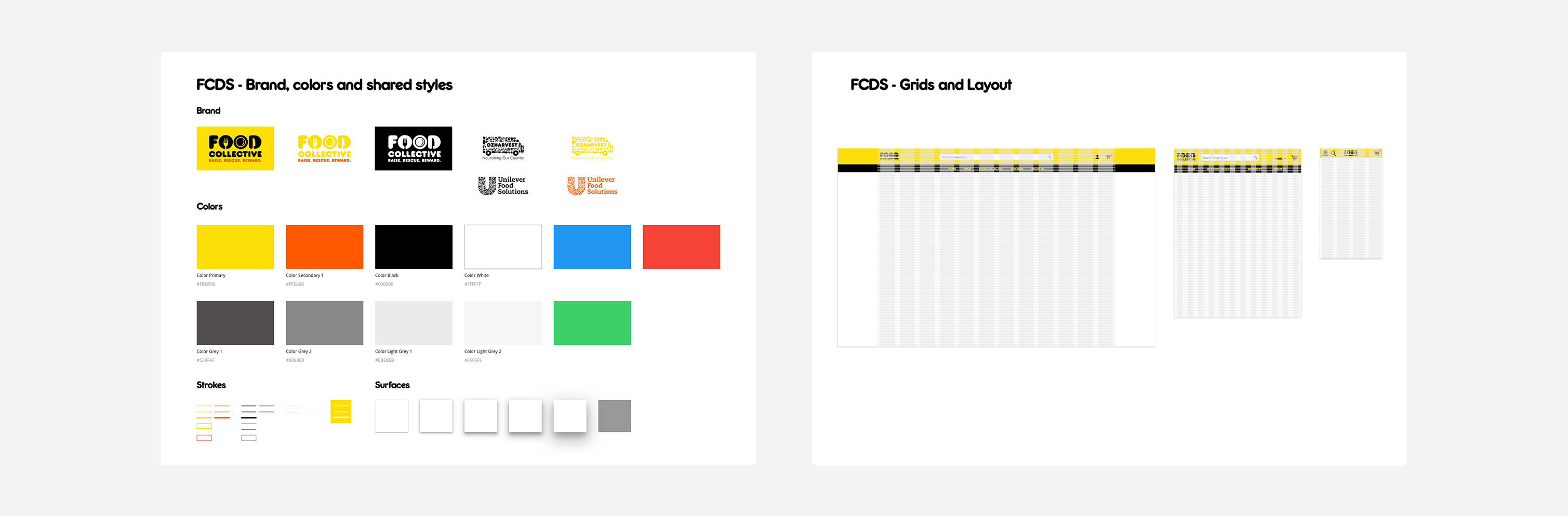
The client had already provided us the brand guideline, it has defined the typography, colours, and basic icons. We use it as the foundation and exploring creative design solutions.
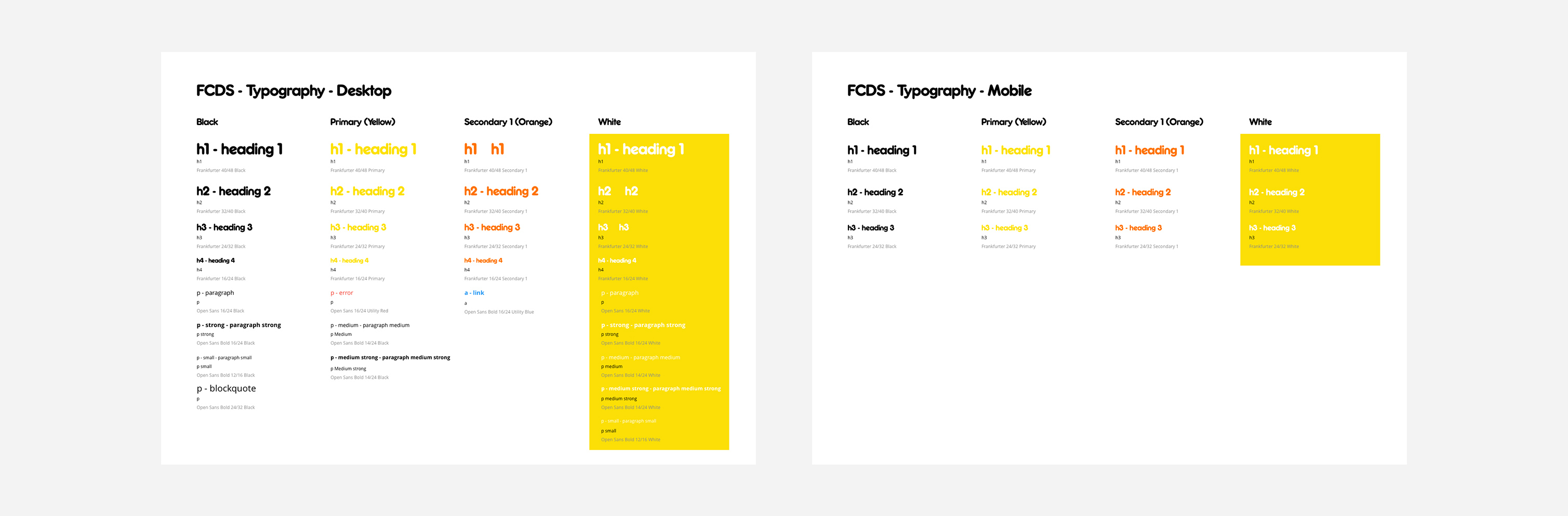
The design system is built in Sketch, which allows different teams spend less time duplicating work and more time building great customer experiences. Firstly, we need to define the standardised components – Font styles, primary and secondary colours, most importantly grids and layouts.
Creating the components
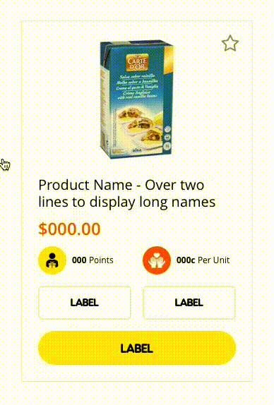
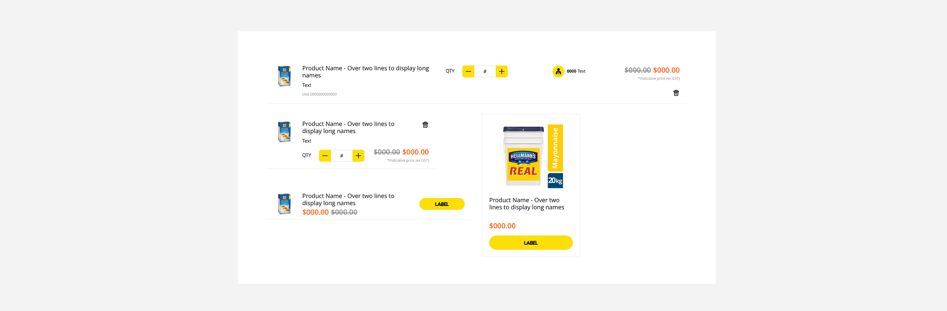
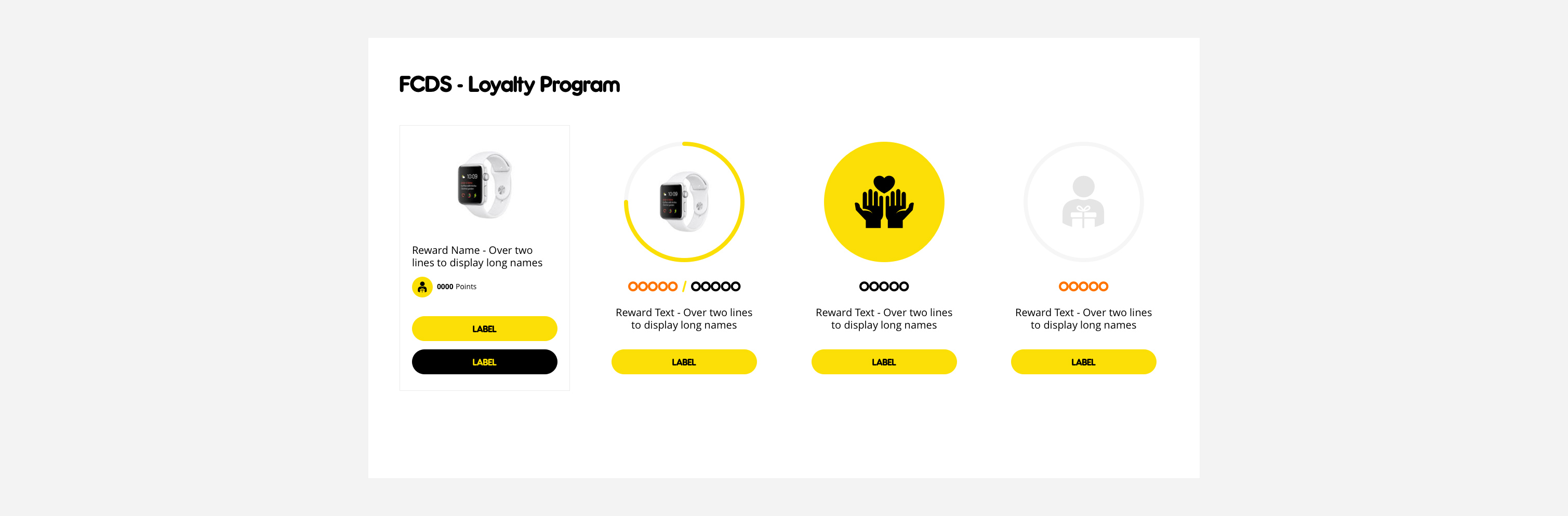
We followed atomic design principles to start with basic assets of the product and assembled them together to build different components.
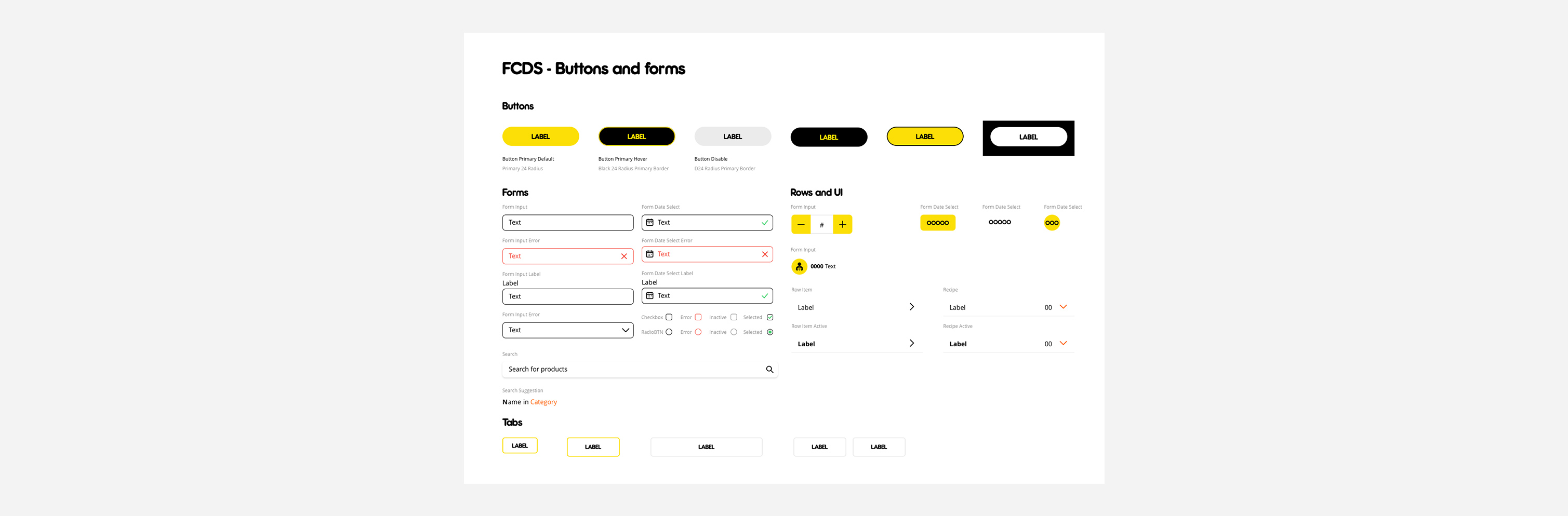
Each component is defined by its required elements (e.g.: title, text, icon, image and CTA button), and may sometimes contain optional elements. These defined in the Sketch as symbols with all the components are resizable, and it can be easily adapted to different screen sizes. White creating these components, we collected them in a master file called the library, which we referred to throughout the design process.
White library was growing, we organising individual components into artboards containing similar items. These artboards were then organised by general category.
Impact
We have brought design time down by close to 35%. No longer working in isolation, teams now spend less time duplicating work and more time building great customer experiences.
We also need to consider the scalability as the product and team grows. A unified design system is essential to building better and faster; better because a consistent experience is more easily understood by our users, and faster because it gives us a common language to work with.
UI Animation