Citibank - Contact Us Page Redesign


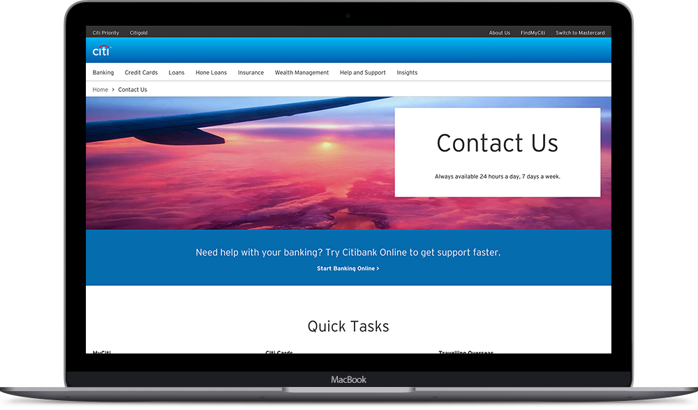
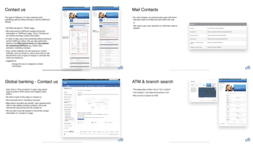
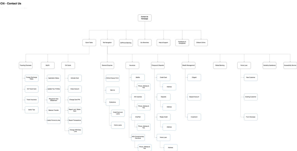
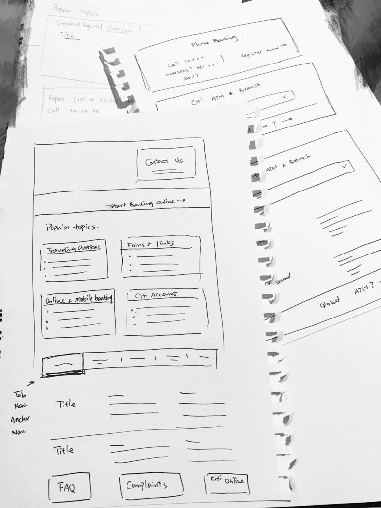
Requested by Citi to redesign their Contact Us page for Citi Australia, making it effortless for user to find information they are looking for. Engage customers with much better experiences, benefiting customers, also helping convert large volumes of traffic from call to digital channels. 

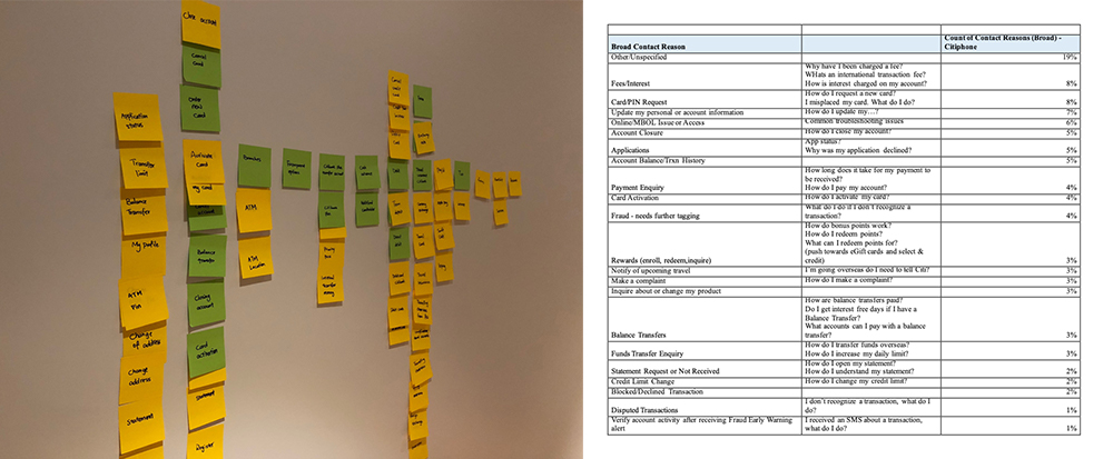
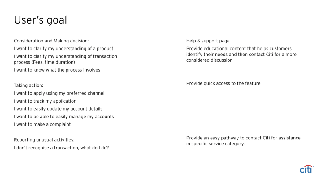
My work involved hosting and brainstorming workshops, interviewing Call Centre staff and analysing metrics from Google Analytics to understand user’s need, researching other competitors, working collaboratively with clients team to get a deeper understanding of the services model.

Problem Statement


With their current website, there are 5 different contact pages and they are only resolving issues for 10% of their customer base in spite of the tool being capable of resolving >60%. The primary reason for this low rate of adoption is the poor customer experience in finding, using and gaining outcomes from the tools. 

The goal is to give Citi’s customers immediate access to the services and resources they want by organising the content effectively and giving multiple access points and paths to their goals.

Ok, let's research


We didn’t have much time, so we immediately started UX audit on current website to identify existing pain points and opportunities. Then talked to Citi call centre staff to get a better idea of what the call reasons are. What are the top features and services customers are requested? Are these services available online? Do user need to pre-fill any information or prepare any document before they contact Citi? We also worked with research team to get web metrics and try to understand what supports or services users are looking for.

Outcome


Based on the insights we got from the research, we translated into user’s goal and re-categorised the page contents as we headed into initial wire-framing. I know that the primarily needs for Citi customer is to access to service without any hassle and find the right contact for assistance is specific service category.


Since we needed to consolidate all pages into one, we decided to break things up into modules, prioritise them and sketch out ideas for tach one and how they might be laid out on the page. We also came up with ideas for some simple new element to improve the page.

The idea is to highlight high-priority, high access services above the fold. this is basically allows Citi customers, who already their online banking user to quickly go to the online service. Also provide Customers access to the service in the areas(pages) that they are likely to visit.


Once we were happy with the basic concept, I moved into sketch by using components from Citi DDL to add some fidelity to the design so that I could create a clickable prototype.

Prototype


We created a quick prototype using Invision. It was clear that most people who visited the Citi contact page wanted to solve their problem, so it was important that we made this as easy as possible. on the existing page, the contacts were grouped by methods, and it’s quite complicated, which created friction for some users. Keeping all existing contact, we visually simplified the table by re-grouping the contacts and prioritising the services. We also provided the access to forms that are relevant to each service to make sure users had all information ready before they contact Citi.

D---0.3-Contact-us---Home---1440px

Test


In testing, we found that we had significantly improved the user’s experience. We wanted to soften the blow of the change to ease users into the new page. We decided to create a simple walkthrough of the new Contact page using Hopscotch.